Going beyond sectors and horizons: When should I set up extra dimensions for my trend radar?

So, you've got your trend radar set up. You've selected your horizons, carefully divided your sectors, and now you're ready to dive deeper. But hold on—before you get too carried away, let's talk about how you can further highlight the information on your radar to make it truly insightful and actionable.
When it comes to making sense of your data, how you choose to highlight key elements can make all the difference. After all, your trend radar isn't just a colorful graphic; it's a strategic tool designed to help you anticipate and navigate the future.
Key takeaways
- Simplify and prioritize: Use colors and sizes to highlight key trends on your radar, but avoid clutter by only including the most critical elements.
- Leverage filters: Apply filters as an alternative to visual gimmicks, keeping your radar clean and balancing visual impact with strategic focus.
- Maximize impact with FIBRES: Use FIBRES to create clear, actionable trend radars that drive strategic success, balancing visual simplicity with deep insights.
Colors: apply this dimension for risk, growth, or trend type
Colors are your best friend when it comes to quickly highlighting key factors on your radar. One typical use is to communicate the risk level associated with different trends. You can, for example, think of it like a traffic light:
- Red: High risk. These trends could disrupt your industry or business model.
- Yellow: Moderate risk. These trends are on the radar but aren’t setting off alarms—yet.
- Green: Neutral. These trends are stable, and while they might evolve, they aren’t expected to bring about major changes.
Another option could be to use bubble sizes to represent the development stage of a trend. For instance:
- Red: High growth trends.
- Green: Stable trends.
- Blue: Declining trends.
A well-thought-out color-coding system allows your team to quickly assess which trends require immediate attention and which ones can be monitored over time. But remember, simplicity is key—stick to 3-5 key colors to avoid overwhelming your radar.
It’s also crucial to consider color blindness when designing your radar. Around 1 in 12 men and 1 in 200 women experience some form of color blindness, so relying solely on color can make it harder for them to interpret your radar. We recommend using color-blind-friendly palettes to ensure your radar is accessible to everyone.
In the below trend radar example coloring follows trend type – regular trends are colored in blue and megatrends in black. This is the default coloring that our software follows unless a special color dimension is defined.

Sizes: great axis for impact, significance or development stage
The size of the bubbles on your radar can represent the impact or importance of a trend. Larger bubbles might signify trends with a bigger influence on your business, while smaller ones could represent less critical trends. This visual cue helps you prioritize where to focus your energy and resources.
Some of our clients also use bubble size to indicate the development stage of a trend. For example:
- Large bubbles: Rapidly growing trends.
- Medium bubbles: Stable trends.
- Small bubbles: Declining trends.
However, it’s important to be cautious when using multiple sizes. Too much variation can clutter your radar and reduce the clarity of your most important insights. At FIBRES, we recommend sticking to a maximum of three bubble sizes to maintain simplicity and readability.
Below is an example of defining the size dimension with our in-built trend radar design tool. With our tool, you can give bubble sizes just the meaning your use case requires – or go without extra dimensions, if you want to opt for a simple radar with no extra dimensions.

Shapes: an additional axis, but use with caution
The final visual highlight to mention is the use of different shapes. Typically, trends and technologies are plotted on a radar with simple circles, but varying the shape can add an extra dimension to communicate more about your trends.
That said, FIBRES doesn’t support the use of shapes, and there’s a reason for it. From our experience, combining shapes with sizes and colors often becomes overwhelming for most stakeholders. It can complicate the radar, making it harder to interpret. That’s why we don’t offer this feature, and we wouldn't recommend using it—especially alongside other axes already in play.
Shapes can be used to indicate the trajectory of a trend. For example:
- Upward arrows: Trends on the rise.
- Downward arrows: Trends that are declining.
- Circles: Stable trends.
While assigning shapes can help quickly communicate which trends are gaining or losing momentum, remember that simplicity is key. Often, colors can be used to replace shapes to convey the same information more effectively. Using colors to represent different trend trajectories can simplify your radar and make it easier for stakeholders to understand at a glance.
For instance, Zalando Tech Radar uses upward arrows for technologies on the rise, downward arrows for those in decline, and stars for new trends. In addition, they use a color dimension to highlight which horizon (Adopt, Trial, Assess, Hold) the technology belongs to. But, as always, balance and clarity should guide your decision.

Remember to balance visual impact with strategic focus
The beauty of a trend radar lies in its ability to distill complex information into an easy-to-read format. If you start adding too many layers of categorization—colors, sizes, and shapes—you risk turning your radar into a confusing jumble of information.
Before you add another category or layer, ask yourself: Is this really necessary? Each element should serve a clear purpose, guiding your team to the most important insights without overwhelming them. By taking this step, you ensure that your radar remains both clear and inclusive, making it easier for your team to collaborate effectively.
Below we outline 2 ways you can refine your radar to focus on what really matters, without drowning in a sea of colors, sizes and shapes.
Alternative 1: Use filters to keep your radar clean and focused
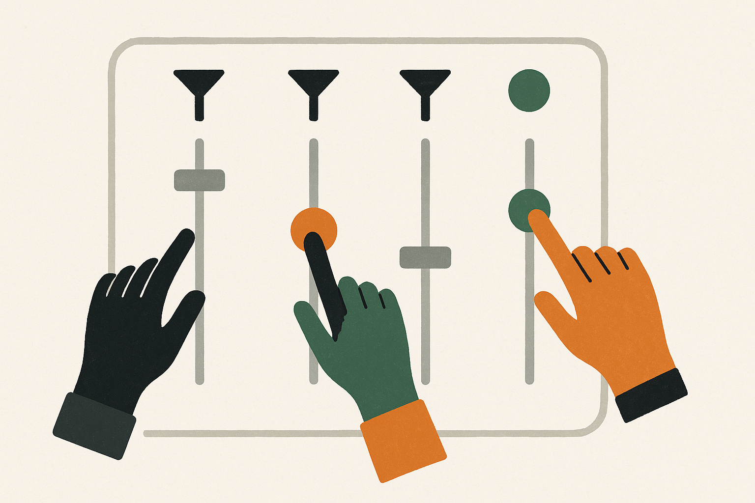
Not all categorization criteria need to be immediately visible on your trend radar. One of the best ways to maintain a clean, focused radar is by using filters. This approach allows you to keep your radar simple while still giving you the ability to dive deeper into specific areas when needed.
For instance, if you've tagged your trends with metadata, such as which business units or functions they impact—like logistics, sales, or R&D—you can use filters to display only the trends relevant to a particular function. This keeps your radar clear of unnecessary visual clutter while still providing detailed insights when needed.
With FIBRES, you can easily tag trends with relevant metadata and apply filters to customize your radar view. This flexibility ensures that your radar remains user-friendly and focused, without overwhelming you with information.

Alternative 2: Use multiple radars to for different levels of detail
Another approach to consider is using multiple radars to provide different viewpoints on the same trends. For example, you might create one radar for internal use that includes detailed data and another for external sharing that highlights only the most relevant trends. This can be especially useful when communicating with various stakeholders who may need different levels of detail.
FIBRES supports this by allowing you to create multiple radars, each tailored to specific purposes or audiences. You can also share radars publicly or keep them private as needed, ensuring that the right information reaches the right people in the right format.
By leveraging these features, you ensure that your trend radar is not only effective and focused but also versatile enough to meet diverse needs.
Why FIBRES is your go-to tool for trend radars
Here’s where FIBRES comes into play. Our platform isn’t just about creating beautiful radars; it’s about creating effective radars.
With FIBRES, you can easily save all your trends, categorize them, and design your radars to highlight the most crucial information without overcomplicating things. Whether you’re using one radar with extra dimensions or multiple radars to cater for all your use cases, FIBRES gives you the flexibility to tailor your trend database to your specific needs.

So, as you continue to refine your trend radar, remember: simplicity and clarity are your allies. With FIBRES, you’ve got the tools to build a radar that’s not just visually appealing, but truly insightful. Ready to see how it works? A meeting with our product expert is a great place to start. Dive into FIBRES today and start building a trend radar that will guide your strategy for years to come.

Timing your trends right: how to set effective horizons for your trend radar
→ Read more
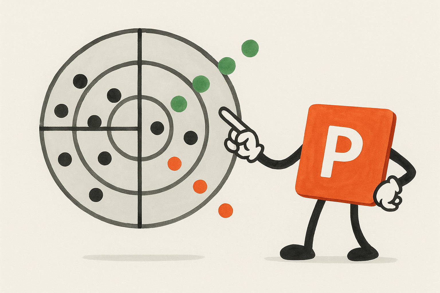
The real pros and cons of PowerPoint trend radars in foresight work
→ Read moreExplore our Foresight radars guide
This article is part of our Foresight radars guide, designed to help you strengthen foresight capabilities and advance your organization’s foresight maturity. Gain insights from practitioners, find practical answers, and share knowledge with your colleagues. Read online or download the PDF to take with you.
Stay in the loop
Get our latest foresight tips delivered straight to your inbox. You may unsubscribe from these communications at any time.